Saturday 22 December 2012

How I improve an image using PhotoShop


I began by choosing and image of a woman from the internet.  I selected the image went to enhance > adjust lighting > brightness and contrast. 
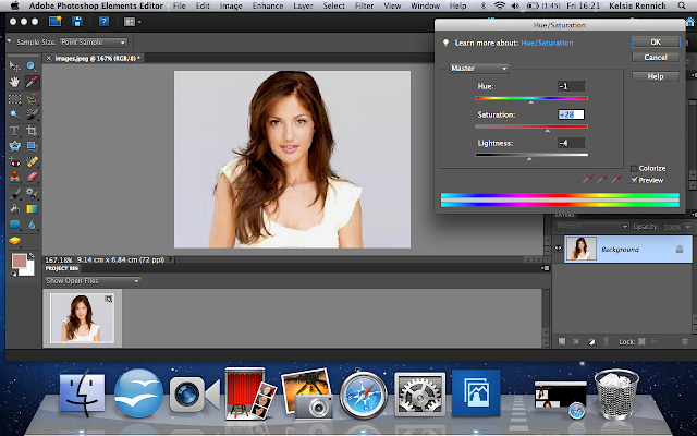


Once on the tab for hue and saturation I moved the dials until I got the image to look enhanced.


I then used the quick selection tool, selecting the edited woman then going to select > feather, this will make the image have visually smoother edges when moved onto a white background. 


Here I am showing how I chose to feather the image by 10 pixels.


Once I had finished editing the image I moved it onto a white background as the previous one it came with from the internet had a grey tint.


I then saved the image as a JPEG to enable me to post the finished product on my Blog.
The above image is my finished edited image.

This is to show the comparison of the original and modified image.

Friday 21 December 2012

Original Images v Modified Images

In order to improve the image quality of the above image I changed the brightness and contrast, increasing both slightly.


To improve the image, like previously, I enhanced both the contrast and brightness of the image. In addition I used the spot healing brush to correct any imperfections like under eye bags and spots, this gave Rochelle an 'airbrushed' look.

Thursday 20 December 2012

Music Magazine Front Cover


This is my completed music magazine front cover. I really like the way the main cover image has a light effect on the right side of Rochelle, which is brighter then the left because I believe it compliments the differing light and dark of the grey background. Also I believe the colours of Rochelle's shirt goes perfectly with the grey background because of the contrast. In addition the proportion of the cover image fits perfectly with the layout of the front cover, overall I am very happy with my finished music magazine cover and believe it looks professional. 

Finished Music Magazine's Contents Page


This is my finished music magazine contents page. The only difference I made from my second attempt is that I added 3 extra images of Rochelle because there has to be a minimum of 6 images throughout production work to pass.

Music Magazine Double Page Spread


This is my finished double page spread which I believe looks much more like a music double page spread then a fashion double page spread which was what my previous attempt of my double page spread looked like. I believe it looks more like a music magazine because of the situation of the columns, the position of the quote and the fact that it has "Rochelle" as a heading. I'm very pleased with the outcome of my double page spread and think it looks professional.


Music Magazine Contents Page Second Attempt


This is my finished contents page for my music magazine. I made the changes needed to my previous attempt of my contents page and I believe the changes have improved it. The thing I like the most about my contents page is the symmetry of it which I think helps it to look more professional.

Monday 17 December 2012

Music Magazine Contents Page - Attempt


This is my first attempt at my music magazine contents page, however I do not like it because in my opinion it does not look like a professional contents page. I believe this is because it doesn't have all the elements a contents page needs, for example subheadings underneath the features. In addition professional content pages normally have more then just a features section but also sections for News, Reviews and Guides. In order to make my contents page more professional I will make the changes as said previously which will improve it.