Wednesday, 30 January 2013

Evaluation - Looking back at your preliminary task, do you feel you have learnt in the progression from it to the full product?


When I first started creating my preliminary task I was new to almost everything that I have now learned, including camera shots, terminology and the use of Photoshop and InDesign.  Throughout the production process I learned many different things:

                                I learned that when taking a professional photo for a music magazine, the lighting and a white background are extremely important to enable easy editing and that ‘polished’ look.  The use of both a background and lighting enabled me to capture a much better photo. I made sure that the lighting fell brightly on one side and darker on the other side of the artist’s face to represents that she, like everyone, can have a good and a bad side. http://kelsierennick.blogspot.co.uk/2012/12/front-cover.html However, for my double page spread image I wanted it to look as if my artist had taken part in a photo shoot so I had to make sure the lighting was a completely even, bright light that consisted of minimal shadows. http://kelsierennick.blogspot.co.uk/2012/12/double-page-spread.html


                          When taking my images I learned about different camera angles and the effect they have. In my preliminary task the image is very close up and had no tilt at all, this made the photo look very unprofessional, flat, dull and lacked a message. http://kelsierennick.blogspot.co.uk/2012/10/magazine-front-cover-contents-page.html After looking back on my preliminary task and learning new skills I changed the way I used the camera, adding a slight tilt and lighting to create a more professional look. http://kelsierennick.blogspot.co.uk/2012/12/front-cover.html


                      When asking my real magazine I used the skills I had acquired on Photoshop and InDesign to help make my magazine appear more professional. I especially changed the colour tone and feathered the image more to make it look more professional. http://kelsierennick.blogspot.co.uk/2012/12/double-page-spread.html


                       In my preliminary magazine the outfit I choose had no link with what my magazine was about as I didn’t put much thought into how costume can reveal so much about somebody. Therefore, in my music magazine I made sure that the outfit would be eye catching and portrayed a message. (Spoken briefly about in ‘How does your media product represent particular social groups?) http://kelsierennick.blogspot.co.uk/2013/01/how-does-your-music-magazine-represent.html
  

              In addition to the above I also learned how to use PhotoShop which helped to make my photos appear both professional and aesthetically pleasing. http://kelsierennick.blogspot.co.uk/2013/02/how-i-improve-image-using-photoshop.html    


Saturday, 22 December 2012

How I improve an image using PhotoShop


I began by choosing and image of a woman from the internet.  I selected the image went to enhance > adjust lighting > brightness and contrast. 
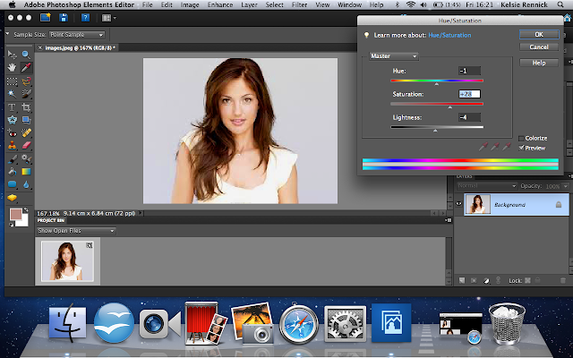


Once on the tab for hue and saturation I moved the dials until I got the image to look enhanced.


I then used the quick selection tool, selecting the edited woman then going to select > feather, this will make the image have visually smoother edges when moved onto a white background. 


Here I am showing how I chose to feather the image by 10 pixels.


Once I had finished editing the image I moved it onto a white background as the previous one it came with from the internet had a grey tint.


I then saved the image as a JPEG to enable me to post the finished product on my Blog.
The above image is my finished edited image.

This is to show the comparison of the original and modified image.

Friday, 21 December 2012

Original Images v Modified Images

In order to improve the image quality of the above image I changed the brightness and contrast, increasing both slightly.


To improve the image, like previously, I enhanced both the contrast and brightness of the image. In addition I used the spot healing brush to correct any imperfections like under eye bags and spots, this gave Rochelle an 'airbrushed' look.

Thursday, 20 December 2012

Music Magazine Front Cover


This is my completed music magazine front cover. I really like the way the main cover image has a light effect on the right side of Rochelle, which is brighter then the left because I believe it compliments the differing light and dark of the grey background. Also I believe the colours of Rochelle's shirt goes perfectly with the grey background because of the contrast. In addition the proportion of the cover image fits perfectly with the layout of the front cover, overall I am very happy with my finished music magazine cover and believe it looks professional. 

Finished Music Magazine's Contents Page


This is my finished music magazine contents page. The only difference I made from my second attempt is that I added 3 extra images of Rochelle because there has to be a minimum of 6 images throughout production work to pass.

Music Magazine Double Page Spread


This is my finished double page spread which I believe looks much more like a music double page spread then a fashion double page spread which was what my previous attempt of my double page spread looked like. I believe it looks more like a music magazine because of the situation of the columns, the position of the quote and the fact that it has "Rochelle" as a heading. I'm very pleased with the outcome of my double page spread and think it looks professional.


Music Magazine Contents Page Second Attempt


This is my finished contents page for my music magazine. I made the changes needed to my previous attempt of my contents page and I believe the changes have improved it. The thing I like the most about my contents page is the symmetry of it which I think helps it to look more professional.

Monday, 17 December 2012

Music Magazine Contents Page - Attempt


This is my first attempt at my music magazine contents page, however I do not like it because in my opinion it does not look like a professional contents page. I believe this is because it doesn't have all the elements a contents page needs, for example subheadings underneath the features. In addition professional content pages normally have more then just a features section but also sections for News, Reviews and Guides. In order to make my contents page more professional I will make the changes as said previously which will improve it.

Wednesday, 28 November 2012

NME Reader Profile

What does NME's reader profile suggest about target audience?


  • The type of clothes they wear (polos) which are comfortable and not overly extravagant. 
  • The brands they wear (H&M, Puma, TOPMAN, FRED PERRY, Adidas, K-SWISS) showing that they like to look nice but doesn't have to wear high end designers or pay a lot of money for their clothes.
  • The shoes they wear (converse) shows again they want to be comfortable but not spend huge amounts of money.
  • The type of alcohol they drink (Jack Daniels, Carling) along with fizzy drinks (Pepsi) which are all accessible. 
  • They enjoy their technology (Laptops, Playstation, Xbox) and enjoy having a gaming experience.
  • The hair gels show that they take pride in their appearence.


Sunday, 18 November 2012

Music Magazine Double Page Spread - First Attempt


This is my first attempt at creating my double page spread for my music magazine. Although I believe it looks like a magazine's double page spread, I do not believe it looks like a music magazine double page spread because of its layout and lack of title. However, I really like the image so will keep it when I improve my double page spread but will not keep the layout. I believe if I change the layout of my double page spread and fit in a title it will look more professional.

The above image is to show the whole of the double page spread because the above image doesn't.

Saturday, 17 November 2012

Target Audience Profile


Using my mood board I created a target audience profile for readers of Moloko. Again like with the mood board this will further help me to create a magazine which I believe will suit my target audience.  

Friday, 16 November 2012

Target Audience Mood Board


The above image shows what I believe my target audience for my magazine would be interested in, wear, eat and look like. This will help me in deciding what information and images I would have in my music magazine.

Tuesday, 16 October 2012

Experimenting With Colours

Blue

Red

Orange

Pink

Grey

Turquoise

Green


This is the style and layout I want my finished music magazine to look like. I really like the simplicity of these magazine layouts because they look professional, sleek and stylish. Because I had created the perfect layout of my music magazine I decided to experiment with colours to help decided which could I would like my magazine to be. After looking at all the colours about I decided to go with the could grey because I believe it is more likely to attract my target audience compared to the bright colours. I believe grey is more likely to attract my target audience because the consumers reading Moloko are more likely to wear darker colours and have the 'grundge' look, which in my opinion is what the colour grey represents.

Monday, 15 October 2012

Designing My Music Magazine


I placed my masthead, tag line and barcode onto my magazine where I want them to stay. I then started to experiment with background effects. For this effect, on PhotoShop, I used the render filter effect to create the 'spotlight' look. However I did not like the way this looked so I continued with different ideas.